

In the ideal world…
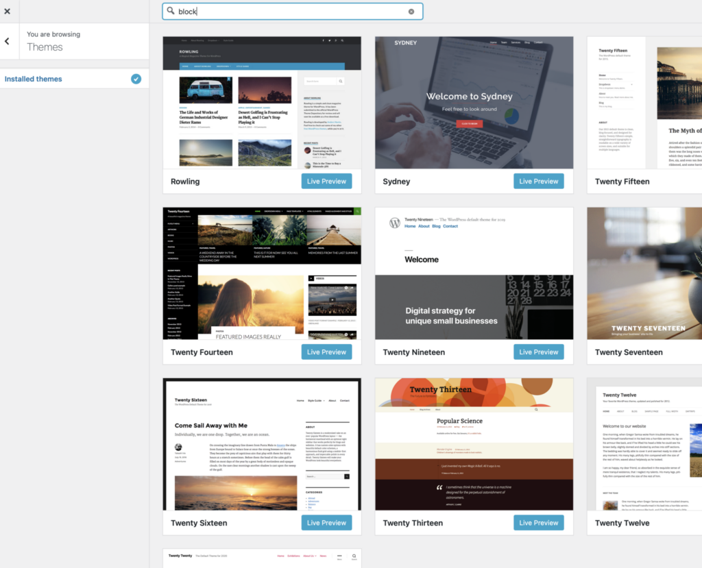
we would have a theme with a BOLD site title, a brief tagline, and fixed menu. We would have full-width pages, no empty sidebar space, and simple colors. For now, we have a few dozen themes to choose from and it’s best we select a theme compatible with Block Editor. Below I list 14 different themes:
01.
Twenty Seventeen
Bold site tile, cover image, full width pages, one or two column blogs.
02.
Twenty Fifteen
Title, tagline, menu and widgets are static on the sidebar, which means no wasted space
03.
Twenty Thirteen
Strong title, tagline, and menu, but the color scheme is limited to fall colors
04.
Rowling
Bold title, tagline and static menu, however sidebar is fixed and it creates dead sidebar space
05.
Radiate
Strong title, tagline and fixed header menu, but sidebar creates dead space
06.
Chunk
Clean and bold title, vertical alignment, but it has an empty sidebar area
07.
Canvas
Bold title, tagline, and menu. Sidebar is not removable
08.
Attitude
Simple header and color, customizable padding, can get rid of sidebar (empty space), but font is not ideal
09.
Sidney
Strong title, tagline, and menu is centered. Customizable fonts and font sizes, colors, and blog arrangement
10.
Twenty Sixteen
Customizable colors, can get rid of sidebar, static menu, bold title
11.
Twenty Twenty
Full width pages, widgets, customizable colors, bold page titles, menu is small
12.
Twenty Fourteen
Dark header, right sidebar is removable, cool overlap between blog title and feature image
13.
Twenty Twelve
Full width pages, can get rid of sidebar
14.
Twenty Nineteen
Menu, site title and tagline are crowded on the header, little customization options
THEME FEATURES TO CONSIDER….
- First, building the content in our portfolios takes time and for the first year or so we might not have enough content to necessarily need/want/ use a sidebar. Ideally, we would choose a theme with full-width pages and no sidebars, only footers is ideal (ie Twenty Twenty). Many themes contain sidebars that cannot be removed which means we end up with empty space if we do not populate it with content. To solve this issue you might consider activating the Full-Width Pages plugin and see if it resolves this issue! Sadly it does not for all themes (ie Radiate)
- Secondly, it is important that people remember who you are and your name when they visit your site. Our ideal theme would have a very bold site title and corresponding tagline (ie Chunk, Rowling, Twenty Fifteen).
- Third, our ideal theme would have a “sticky” menu and header. This means our site title and tagline, and menu would stay pinned to the top of the page (or side) even as we scroll through the page/ site (ie Radiate, Twenty Twelve).
- Fourth, ideally our theme would organize a post feed in 1-2 columns, using our post title, date, feature image, and no word excerpt (ie Rowling). However for most themes we could solve this issue by downloading the Advanced Excerpt and Page Excerpt plugins.
- Lastly, being able to customize features such as fonts would be nice but in my opinion less important. At a bare minimum, our theme would allow us to customize the header so it could include a cover image if we wanted, and select the colors of headings, hyperlinked text, and background color (Twenty Twenty). In my opinion having three color schemes would suffice.